I bet you’ve already spent many hours crafting an ingenious landing page to make it convert like there is no tomorrow. And chances are this hard-won page still doesn’t show results you seek to. We’ve all been here, am I right?
However, it’s not over yet. No matter how crowded your market is and how powerful your competition is. The more rivals, the better. You can benefit from your competitors’ name and traffic to increase your own conversions. Just go head to head with them on a landing page specifically designed to put front and center how you are better than the competition.
The truth is prospects adore doing comparisons to competing products or services. Check Q&A sites, Google Keyword Planner or even Google search: the internet is full of discussions on how Product X is different from Product Y. Fortunately, this provides us a brilliant opportunity to take advantage of this comparison process and create a high-conversion landing page. The numbers say that this tactic increases a buyer’s intent to purchase a service or product by 22 percent.
In this article, you’ll find a step-by-step guide on how to go head-to-head with your rivals using a comparison landing page. Let’s dive right in!
Start from researching your competition organic traffic
If your business rivals are big and mature enough, they already win industry-related keywords and own the organic search results. The key here is to optimize your landing page for the specific phrases like ‘Your Product vs Their Product’ and ‘Their Product alternative’. You can discover the exact terms your prospects are searching for with the tool like Google Keyword Planner. Then, be strategic crafting your copy to help them find your business.
It’s not about ‘stealing’ traffic. It’s about introducing yourself to people already looking for an alternative. Ultimately, a comparison of landing pages helps prospects find the company that better suits their needs. And if you are not on top of your game, be sure — the competitors will politely introduce themselves to your dissatisfied customers.
Avoid the risk of being sued
Crafting your comparative landing page, don’t forget to pay attention to trademark laws. We have put together a shortlist of common rules that are worth to follow.
First, don’t distort your competitor’s trademark or logo in any way. There is no need to mention that creating a parody of your competitor’s trademark is a poor idea as well. At the end of the day, healthy competition and respect are everything. Also, use the ® symbol in the case it is a registered trademark and put a standard disclaimer as ‘All trademarks belong to their owners, etc.’
Second, your every claim placed on the comparative landing page must be true. We don’t want to mislead our prospects, do we? It’s a great idea here to refer to some kind of third-party credible studies that confirm your words.
And last but not least, mention the date you have made the comparison. Why? The reason is quite obvious: if something changes, you don’t turn into an unwitting lier. The good idea here is to monitor your competitors’ business moves with the tool like competitors.app.
You come, you differentiate, you conquer
So, down to business. You have already know your what competitor you will be compared to on your future comparison landing page. Now the question is how to set your products apart.
Here comes the need for upgrading your competitive intelligence skills, or simply put, an ability to collect actionable information on your business’ environment. The more thorough your competitor research is, the more prepared you are for crafting a high-conversion landing page. Due to that, you’ll get insights on how to differentiate your product: by robust features, good-value price or brilliant benefits.
Whichever way you go, there are a few crucial questions you should answer on your page. Why should a potential customer choose your service vs the market leader? What pain points does your product solve vs your competitor’s product? I think you have got the idea.
Prepare a great copy
There is an ocean of comparison page elements that skyrocket conversions, but nothing can beat an inarguably great text. Meticulously researched copy that accurately points out the differences between competitors, sells your product better than sophisticated web design.
So, become addicted to details and facts. For instance, if you market a SaaS, perform competitor analysis by downloading your competitor’s app and examine it’s every nook and cranny. Yes, it takes a lot of time and efforts. And yes, you will be paid off with the killing content that is cut out for generating leads.
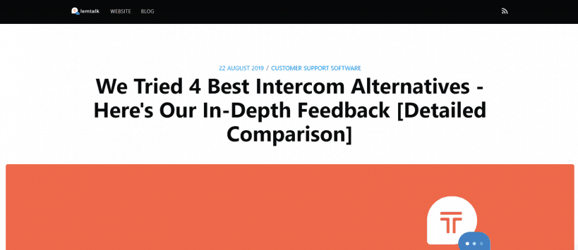
And remember that some of your potential clients may not be familiar with any of the products. Therefore, a blog post is a good place to spell out the difference between you and your business rivals as lemtalk – Intercom alternative live chat and helpdesk software for Slack did:
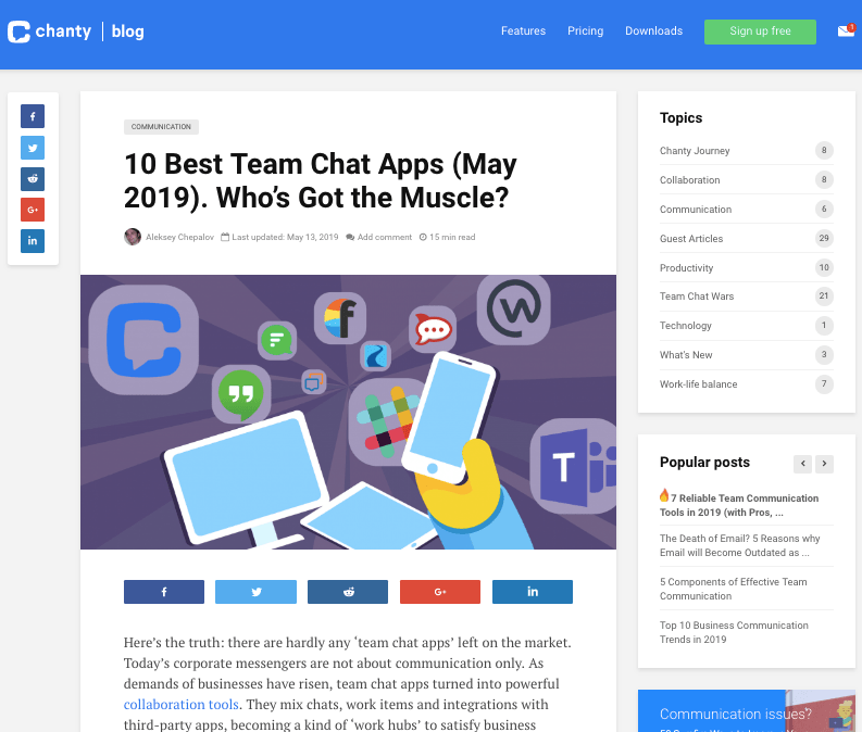
or as Chanty, a simple AI-powered app chat, did:
Inject a dose of trust marks
Trust marks are crucial when it comes to conversion rate. They are especially important when a potential client has never come across your company before. You should make them believe that your product is able to solve their issue better in comparison with a well-known competitor.
Display customer testimonials or their company logos, awards, mentions incredible media, case studies–anything that builds social trust and encourages prospective clients to convert.
Want some brilliant tips? You can even show opt-ins, sales or other recent conversions as well as your current visitor number with the help of social proof tools. These tools help you stay clean when it comes to claiming that others have opted for your product.
Don’t hesitate to address many competitors at once
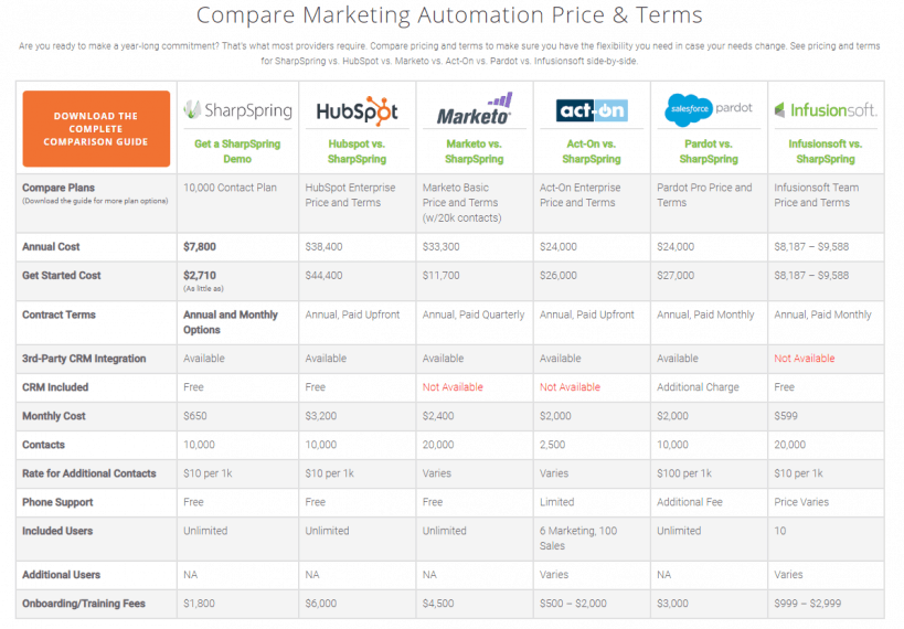
General competitor comparison pages describe your benefits over an entire competitive niche in one fell swoop. In a too crowded market, sometimes there are too many competitors to address individually. SharpSpring has walked down a different path. Having many similar features, this company brings up five competitors at once to rise above the fray with the message like ‘If we are almost the same, why pay more?’
Don’t promote your business rivals
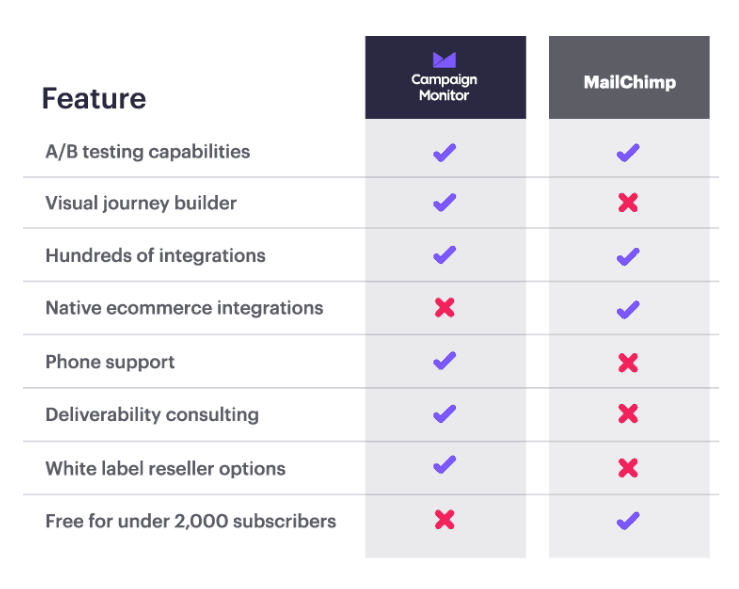
Creating competitive comparison pages is, in a way, some kind of advertising for the brands you want to beat. So, it’s a good idea to exclude their branding from your comparison landing pages. Below, you can see that Campaign Monitor has removed the MailChimp logo from their comparison page and simply listed the company name:
Spice it up with compelling visuals
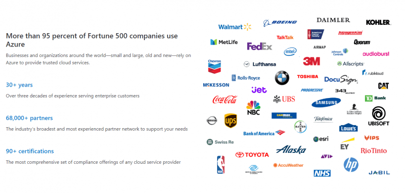
People always want to see and feel how exactly you differ from the competition and what they pay for. Researches show that 65 percent of all people are visual learners. What’s more, visual memory places in the same part of the brain where emotions are processed. In other words, visual memory and feelings are tied together physiologically.
Therefore, comparison of landing pages should not be boring. Persuasive and compelling images are crucial for creating an emotional connection and fostering the buying process. With the help of a simple graphic, Microsoft convinces the material benefit of their services. And that resonates better than words:
Become a storyteller
Everyone and their moms know that a good website copy should provide your prospective clients with the key insights about your product and their ability to solve their challenges. A good marketing story should evoke empathy and build a deeper emotional connection that leads to prospects’ proactive steps, for instance, purchases.
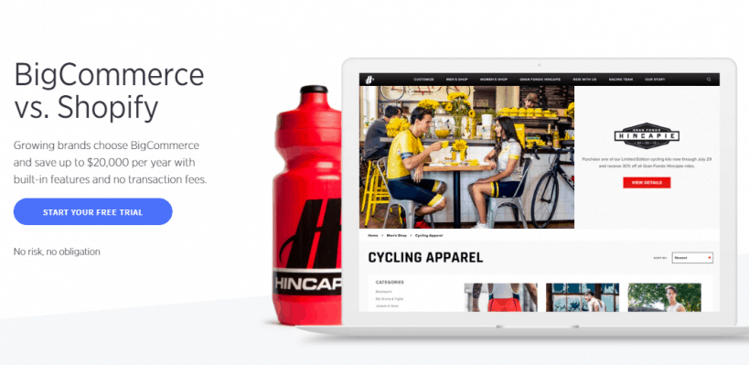
BigCommerce, in addition to having compelling landing page design, shows people that Shopify, their main competitor, is the outdated and unfavorable option for unprofitable businesses. In fact, BigCommerce sets up a conflict that resonates with every prospect who strives for success and growth. That gives BigCommerce a better chance of holding prospects’ attention and influencing their decision to make a purchase:
Make the product switch as quick and easy as possible
Seamless and no-brainer product switch pulls prospective clients to your company.
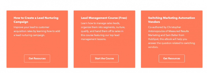
That needs to be top of mind when executing comparative marketing as a whole and crafting a comparative page particularly. For instance, Zendesk defeats the power of inertia offering a handy guide on quick migration:
Be as transparent and honest as you can
Establishing trust and building customer confidence in your content take a lot of time. And oddly enough, even when revealing where your product is weaker, you contribute to the future loyalty to your brand. Don’t go from one extreme to another: it’s not necessary to highlight areas where your business rivals beat you. Just share a balanced view.
Build a bold call-to-action
Define the desired next step page visitors should take? Register for a free trial? Schedule a demo or consultation? Attend a webinar? Make a direct purchase? When you figure it out, make sure that your call-to-action appears multiple times throughout the landing page: on the top, bottom and in every important section.
Image Source
Wrapping up
To sum up, a competitor comparisons landing page is not Vanity Fair. Instead, it is the right way to challenge your business rivals. In addition to fostering healthy competition, this type of content provides your prospective clients with the needed information on the road to solving their issues.
And more importantly, competitor comparisons pages, if executed properly, help you convert more visitors and boost your sales. Test out the above-mentioned tips to turn your comparison page into a lead generation machine.
But before you even start creating your competitor comparisons landing pages, you will need to know too much about your competitors, right? Luckily you can create your account for free at Competitors App – online competition monitoring software.
Note: This article is the Guest Blog post by:
Carsten Schäfer is the founder and CEO of crowdy.ai, the first Clients-Convert-Clients Marketing platform. Inspired by principles and mechanisms of social proof, Carsten is currently on his way to help businesses become trustworthy and thrive in the digital landscape.

